
A new project for Aiden Horsley; asked to create a logo and poster for a new ‘theoretical brand’ Common Ground.


After discussing the demands of the client, my initial process was to find a well-known/common electric guitar to use as a base. Deciding on the Stratocaster shape, I recreated the body, highlights, strings and other finer details within Adobe Illustrator. Although Aiden had a clear idea in his head of the desired outcome, I developed the first idea and attempted to create further alternatives that he might think fit better.

Original rendition of the client’s idea 
Cropped concept, taking Aiden’s idea further 
Concept re-ordering original placement and direction of guitars and text 
Contrasting text, layered within the images 
3 attempts at replacing and resizing text to see what works best 

An aspect of logo development that I’ve found to be vital to a developed outcome is trying a large amount of variations with very subtle, almost unnoticeable changes; like the position and sizing of text displayed above. This is important as although the first outcome may be good, the client may be happier with an alternative that I don’t like as much.
Following the development of each of the guitar designs, both the client and I concluded it didn’t have to impact we were hoping for as a logo to define their image. Therefore I offered to create some type/text logos, distorting typeface and creating similar imagery to be recognised as the CG of Common Ground, taking inspiration from an image the client had said to use as reference (below).


Final logo outcome
Poster
The poster requested by the client was to take influence from After Eight mint chocolates. My immediate thought was to incorporate the well known text and implement the illustrative clock design. Recreating my own versions of them in illustrator to allow myself the possibility of rescaling using a vector image once finished.


Again, creating variations with subtle differences – text spacing, colour and textures helped me and client decide that the second option suited the poster better as it created more space and attention for the focal title whilst also giving the date and ticket prices enough separation to avoid looking out of place. In addition, I believe the slight variation of colours with ‘presents’ and ‘line-up’ creates enough distinction to emphasis the more important information & text.


After creating two rough outcomes for Aiden Horsley and Common Ground, I decided to continue developing my 3D design skills using Cinema4D, creating another outcome to send to the client to see which he prefers. Below is my Cinema4D rendition of an After Eight box. To create a more realistic outcome, I attempted to make the colour scheme identical to create a more recognisable outcome. This process tested my knowledge of caps to create smoother or more ridged edges on the packeting, etc. as well as object editing; creating specific segments to invert and move in order to create a hollow box for the other chocolate packaging to sit inside.


Poster Animation | Attempt #1
With my first attempt I struggled with composing the animation as it saves as photo stills and an ‘aec.’ file. However, I was unaware of a compatible plugin to convert the aec. files. This meant I had to place each photo still separately into each frame of the animation which was very time consuming as there were hundreds of frames. Discovering and installing the plugin will help my process a lot as it allows me to begin editing the animation immediately, relieving me of the process of placing each separate frame in a timeline.
Poster Animation | Attempt #2
Adding two additional animation/camera angles of my rendition of after eight chocolates, used to display the vital information about the event; venue, date and ticket prices. I struggled with rendering this as creating a falling animation in Cinema4D can often create random end products – meaning each time I played it through within the program, the outcome was different, without changing any variables. This was very time consuming as I had to continuously repeat the process of letting the objects fall until they could be seen by the cameras I had already key-framed.
Creating an animated background became complicated to implement behind the animation because of the output format I’d decided to save it as. Due to it saving as a mov. file, it creating a black background, as opposed to having a transparent one. In order to have a transparent background I need to save it as a png. files (which later collate into an aec. file) to use for editing.

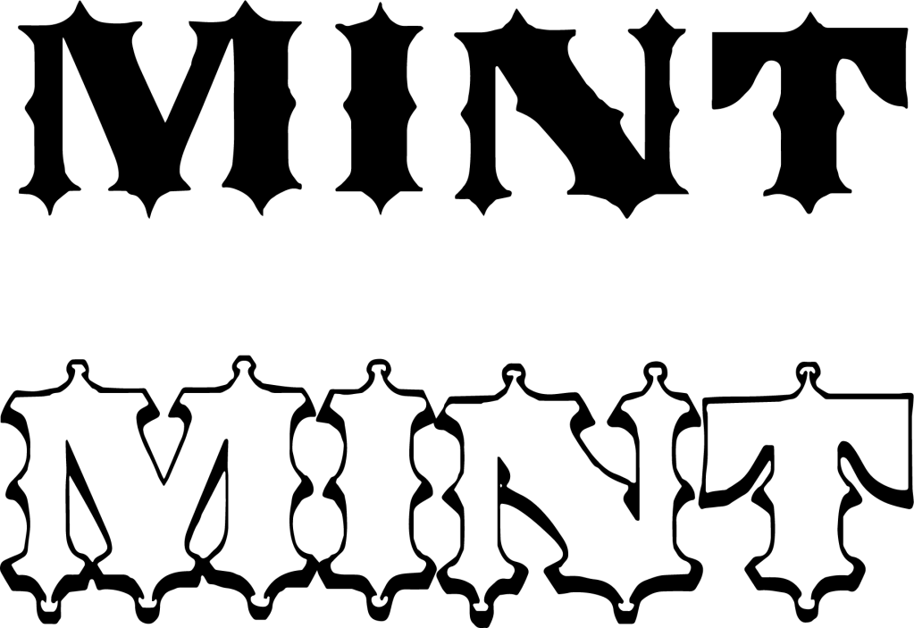

Another aspect that I struggled with when attempting to implement the given logos to the animation was deconstructing them to a format that they could be applied in Cinema4D. In order to do this, you must create work paths in Photoshop and export them as illustrator files. However, as there are varying layers from black to white to black again, the work paths fill the blank and make it one object. I was able to rectify this mistake the with mint logo by splitting it into two separate texts (as shown above) and editing the cap fill when in C4D. However, Fudge’s logo only created a large rectangle around the text. In order to combat this, I inverted the text and removed the rectangles – as the custom font is the recognisable part.
This version of the animation I was able to use the aec. plugin to convert the file straight from rendering into After Effects. What I found was the animation ran a lot smoother/quicker than I anticipated. This altered the outcome I hoped for as I believe it makes some of the animation harder to read, and the audience may not be able to gather all the information required. However, when sent to the clients they gave strong positive feedback. After being able to add the performers’ personal logos to the animation, the only additional change to be made was for the song to be one of Mint’s own tracks.

