
OVERVIEW
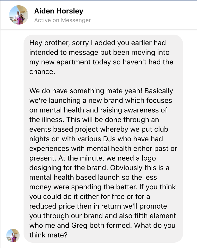
Approached by Aiden Horsley on Facebook, through recommendation by Greg Moseley, to design a logo for a new brand raising awareness of mental health through club nights, events and meetings. As it was for a good cause and a friend, I offered to do the logo design for free but charging for any additional work.

IDEA
The initial concept of the logo design was helped greatly by the client as he had a clear direction and visual concept in mind. Aiden explained over phone call that himself and Joseff wanted a clear image of two hands grasping to portray the unity that the community requires and that the Healthy Minds brand aims to bring. My plan was to find inspiration and sketch out simple forms of potential logos to then scan in and use as a template within illustrator.


In order to ensure a happy client, I kept Aiden up to date with each step, asking for opinions on potential design options. As this brief was kept on a relatively casual basis, it was easy to keep in touch through calls or messages to get clear feedback and points to improve upon. As the image was relatively simple and straight forward, I immediately began working within Adobe Illustrator to create different renditions that the client might like (below).

Conversing with the client, we agreed that the image that represented the brand the most was the top left concept. Expanding on this design, the next step was to add further detail and find the text placement that suits it best and is coherent with the brand image. Wanting to emphasise the strength in the community that the client wishes to demonstrate, adding finer details and shading helped to define the hands and portray a strong grip. In addition, the brand’s text face had to have a similar ‘strength’. Sending various options to Aiden, ensuring the logo and image is being taken in the write direction.


By process of elimination, we collectively decided the bottom left layout was the best option as it accentuates and stresses the importance of the word ‘healthy’. This then gave me time to develop and refine my initial design in order to create a more realistic and clear image for the target audience. It is important that the logo is easily recognisable and memorable in order for the brand to grow. The next step from here was to define the illustration by adding more detail, creating deeper shadows with bold thicker lines to make a more realistic image whilst reflecting the strength and unity that the group aspires to bring


Final outcome

White version of the logo used on a large banner on the DJ booth @ Healthy Minds Launch party
Personal Logos
OVERVIEW
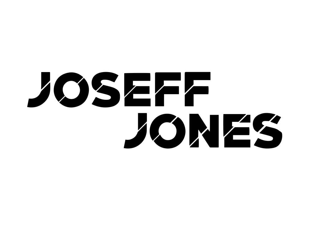
After receiving very positive feedback from the Healthy Minds team about their logo, Aiden returned to ask for more design work; this time for himself and later Joseff Jones. Needing their own personal logos, Aiden asked for a simple text logo for use on any future social media, posters, promo work, etc.

IDEA & PROCESS
Following my regular method, I began researching various text logos to use as inspiration, and sketching some vague ideas in a notepad to later scan in and use as a template when creating my vision within Adobe Illustrator.


I found it important to create a wide range of choices for the client, as they gave no real direction as to what they wanted. To ensure the client’s happiness, it’s important to keep contact; I sent Aiden updates and ideas at every major interval to see which ideas he preferred and if he has any direction he’d like to see it taken.


Happy with the initial design I was additionally asked to produce his friend Joseff Jones a similar logo, as well as some cover photos for Facebook and other social media accounts for both of them. To start the process of Joseff’s I began sketching some rough ideas to clean up and replicate in Adobe Illustrator. The drawings were made very quick as I wanted to make a larger variety of concepts for the client.
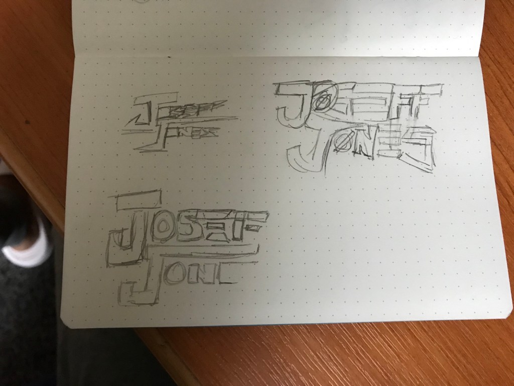
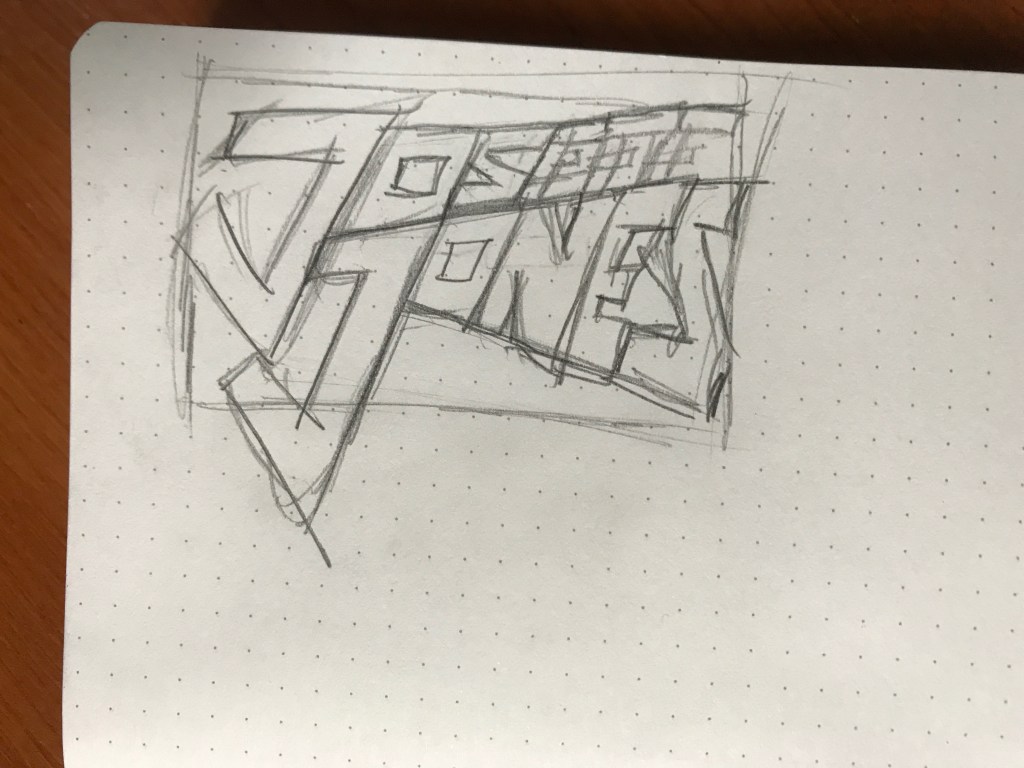
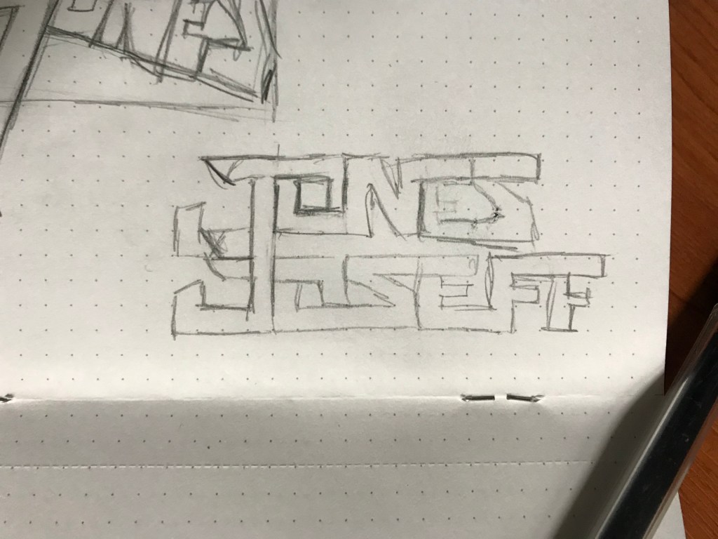


To create further variations, I duplicated some concepts and added warping or distorting effects. These duplications, although not majorly different, offer a separate aesthetic that the client might prefer.
When making the posters, my initial thought process was to make two drastically different styled posters, incorporating the logo as the centre-piece, to help find out what the client does and doesn’t like; receiving feedback to then improve upon the final outcome.


A 3D-looking approach using stock images and various textures to animate the logo versus an illustrative, abstract/geometric approach. As the geometric edit was preferred, I decided to work into it further to develop it; varying the colours to make it more appealing to the audience, catching your attention more and creating more geometric designs, to add more substance.

Please with the work he had seen so far, Aiden came back to me asking to produce event calendars for use on social media in order to promote their upcoming events to their audience in a clearer manner. This was requested to be a quick job, so I wasn’t needed to create a complex image. I asked for their press shots so they can be easily identified to them, using their new logos, a clear bold font presenting the event name as the most important information for anything additional . Using a monochromatic gradient with enough spacing to ensure everything is easily legible. The importance of texturing an image or background, in this case with a grunge-style overlay, has been something that resonates with me since working at Cube Design alongside Rob Dickson.


They both required one for their own ‘DJ’ facebook pages and personal accounts, which have different dimensions. In order to convert the original calendar to their other page dimensions I decided the titles and logos suited the long width upright. This seemingly holds the dates central and acts as a wall either side


Poster Design
Below I demonstrate screen shots of key steps in my process creating a poster for a Healthy Minds event. Unfortunately, the screen recording I made of this process crashed due to unavailable storage on my MacBook as my hard drive is broken and I am unable to currently fund purchasing another.

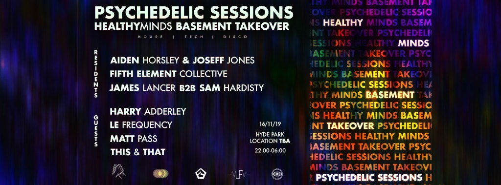
To create a succinct aesthetic throughout the poster, I decided to continue the use of ‘Futura’ for all the text, as it is what I used for the Healthy Minds logo; replicating the ‘bold’ first word and ‘medium’ second. This effect emphasises the first name or most important part of the act name. The background image was made by distorting, blurring and colour correcting a generic image of skittles sweets. Stretching this distortion then gave the ‘psychedelic’ aesthetic.

The next step was reorganising and resizing the date, location and times in order to space the poster better – bringing more attention to the title and lineup. In addition, a spelling mistake in ‘psychedelic’ was pointed out whilst sending screenshots to the client.

After taking a few hours away from the poster, it came to my attention how distracting the background was and resizing the text and adding drop shadows didn’t take away from that fact. Therefore I decided to implement a partially transparent black mid-layer to break it up. Splitting the poster into thirds, I was able to create a more transparent third, displaying the background clearly whilst also highlighting the event name; taking a word from each line in the repetitions.
Another benefit of splitting the design like this was the spacing opportunities. As the lineup is often considered the most important part of an event, it was vital to ensure the names were easily readable, regardless of design, in order to function as a poster.

Much like with the first poster attempt, I scaled down the date, location and time in roder to make more room for the act names and make them the priority.

Dropping the opacity of the black mid-layer helped to emphasise the trippy background subtly, without being too intense and distracting.

Working with good contact with the client helped this design a lot, as he had a clear idea of what he wanted and could help quickly if something was missing or out of place – creating an efficient work timeline.


Work influences


Evidence of the work and effort from the design, logo and other work from Aiden and Joseff paying off, with other 500 people interested in their launch event and over 1,400 people following the Healthy Minds page.

‘Healthy Minds – Psychedelic Sessions 001’: an after movie of a Healthy Minds house party, displaying the logo designs I produced for the Healthy Minds brand, Aiden Horsley and Joseff Jones.
Healthy Minds logo animation
After being impressed viewing my 3D animation made for Common Ground and another for Greg Mosesley (viewable under Common Ground and BOUVIER respectively in blog) Aiden Horsley approached me again asking for more work for the Healthy Minds brand.
Developing the animation to the quality envisioned I began to re-learn different effectors, such as random, and how to program them to distort the text to the parameters required. This involved spending a lot of time watching various tutorials followed by experimenting with the things learnt further through practice.


Creating this animations first step in Cinema4D, was a very time consuming and storage consuming process as making sure the letters formed in a specific time required me to make the animation 1000 frames long. The length of my renders became problematic as my hard drive was broken and my laptop had no storage left available. This made the production of this animation longer than anticipated as I had to find funding for a new hard drive to carry on working.


Healthy Minds animation re-work
After receiving feedback from the client, the animation was considered slightly too slow. In addition to this, Aiden requested to use the logo without the typography underneath. Working on the clients demands and criticisms we were both very happy with the outcome beneath. As it is to be used as a backdrop to DJ sets being played on repeat, the image does not have to be incredibly clear as it will become repetitive and more obvious as time goes on. This is why I implemented a stronger RGB split, creating a ‘trippier’, relatively less eligible effect
Max Pryer – Healthy Minds Poster
Messaged my Max Pryer, a member of the Healthy Minds and Fifth Element collective, asking for a poster design for a new upcoming event. The client emailed some basic information over, including a photograph of the headlining act, to include in the poster. However, dealing with a busier client, Max was unable to send all the vital information, such as event name, times, ticket prices and venue name straight away; delaying my work process.


Important process of taking snapshots of my screen any time I make a major change in order to keep the client up to date. This method, like in other briefs, gives me a better understanding of the client’s wants and needs.


Line illustration becomes too distracting 
Text is easier to read without gradient overlay
Initially wanted to incorporate the two logos that I made for Aiden Horsley and Joseff Jones, however, they didn’t fit the aesthetic of the poster and created an imbalance with the other names in the line-up, therefore, I opted against using them. Struggling to find an outcome I was happy with, developing a new design in a different format looked a better option – wanting to incorporate new skills I have learnt, I looked towards Illustrator.
Poster 2

After learning various ways of implementing the ‘make’ and ‘blend’ tools in Illustrator, from YouTube videos by Sebastian Quintero, I looked to take it further and use it these skills in a brief. To create a 3D illusion, I masked the white frame, making the blended object appear to be coming forward and through the rectangle.

Developing the poster further, I scaled the rectangle and accompanying text down in order to display a larger proportion of the blended object. In addition, I created another with a lower opacity, using a pink-heavy gradient to demonstrate a contrast
The next step for me is to take this design into Photoshop in order to add contrasting shadows and highlights around the text and rectangle to emphasise the 3D effect
Poster 3

Creating distorted helixes for this poster taught me how to code materials in C4D correctly, as in the screenshot above, the material has clear lines (depicting where the material starts and finishes before repeating). This was not my intention, so I learnt how to adapt materials and their gradients/colours to fit specific shapes through experimentation. Using a chrome material for the text and rectangle automatically helps the lighting impact the reflections and shadows from the helixes, which is a process that took extra steps when using Illustrator.

Attempting to stick to the colour scheme from ‘Poster 2’, I was exploring different blending modes of gradient maps in Photoshop. The screenshot above shows the blending mode completely inverting the colours; creating an ominous and dark final outcome. This is something I may look to implement in later work, but was not the desired outcome for this project.

To enhance the 3D image, I decided to create a textured background in Photoshop. Sticking to the two colours, I used various textured brushes, customising the settings to create a random angle, opacity, saturation and hue shift with each use. This allowed me to create a textured gradient, from a deep magenta to a baby pink and a baby blue to deep navy. Then, in order to develop a larger depth of field, I made a black fill over the background, and dropped the opacity in order to darken it, seemingly taking it away from the 3D image.
Time-lapse video of my process creating the above outcomes. Working in Cinema4D to attempt to replicate my second poster for the event, I encountered challenges trying to make a helix spline 3D, then coding it’s axis’ to imitate a similar shape to ‘Poster 2’. This was a big learning process for me; Cinema4D is a hugely complex software with a lot yet to discover, which I aspire to explore from now on to broaden my knowledge and improve my skillset further.
The whole process took roughly two hours, uploading to YouTube allows the public to view my way of work, whilst also being able to slow down the video if interested in step by step actions.

