
OVERVIEW
Started the design process for two new campaigns for Gemini Branding to release in the New Year. Receiving feedback on my initial star sign campaign for the brand from first year, a large audience weren’t massive fans of a large back-print and would rather a squared-off chest print or alternatively a breast pocket design. This is something I set myself the challenge of completing from the beginning of the year, working in collaboration with other designers such as Natalie Galvau, to find the best outcome.


Working from these illustrations, I decided to remove the colour from each of them to make a succinct line drawing collection. This also, in turn, creates a much simpler printing process, as there will only be one layer that can be printed in any colour.


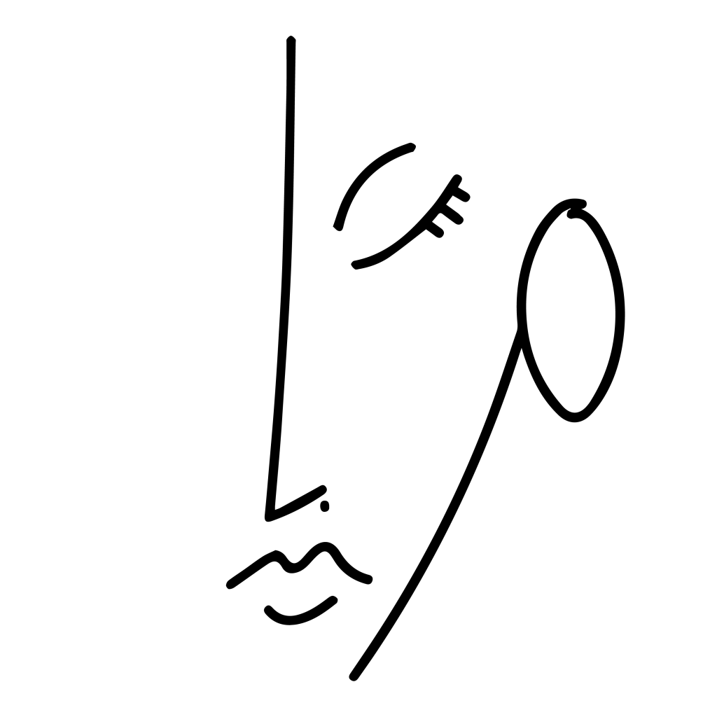


Conversing with Natalie, we decided that these 5 above were the best, in chronological order, best at the beginning. Then began the process of finding what the public would purchase; trying various colour ways, different t-shirt and print colours, etc.
Using social media platform Instagram, I put out a poll asking which people would prefer from white, black, navy or grey t-shirts. However to fit in with recent fashion trends, I thought it would be better to create a coloured variation; differing from my first ever release with Gemini Branding.

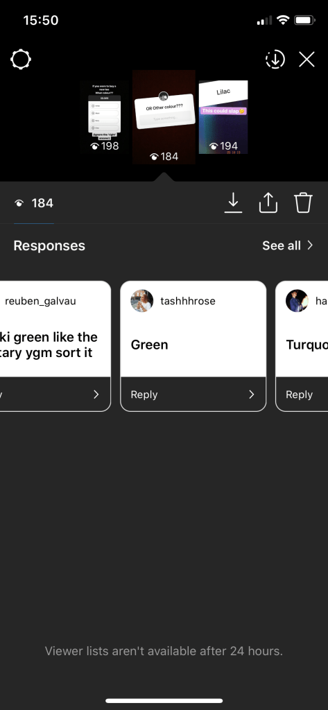
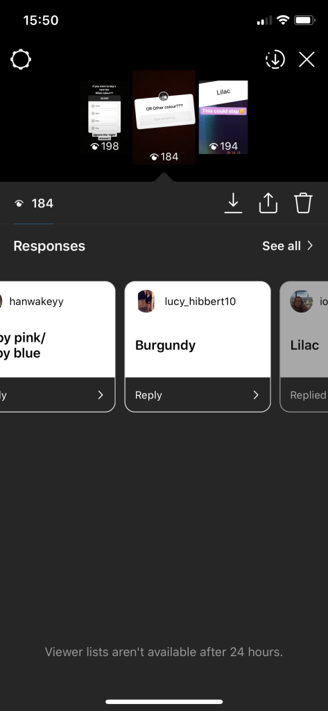
Receiving nearly 50 responses, majority of ‘voters’ were split between black and white, so I offered an option of ‘other colour?’, where people could type their own suggestions and thoughts. With a few responses for other variations, such as baby blue, baby pink, burgundy and turquoise, I decided to stick with colours that are considered more ‘in trend’, focusing on khaki and lilac. Recreating the images to fit the description and posting them again for those interested.
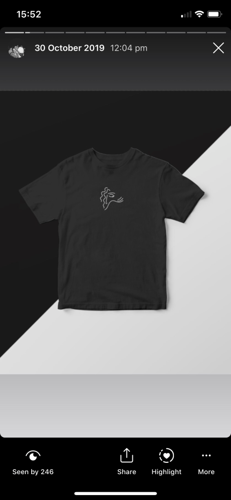
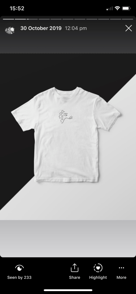

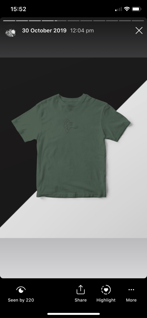
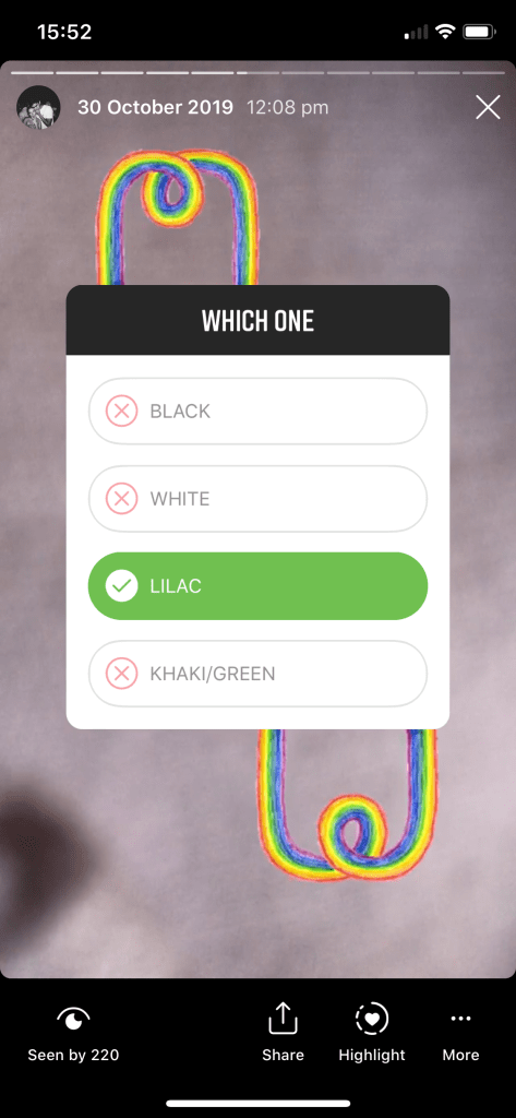

This was interesting, with almost 80 responses, although the public were initially split between black and white, the introduction of lilac as an alternative option swayed a large proportion, making a clear winner. This then left me with the opportunity to offer alternative printing options. However, I was set on keeping the options limited, due to the stress and altercations I found myself with alongside my first release. Allowing customers to choose their own colours and offering a range of t-shirt colours made for a time-consuming, difficult process to keep up with.
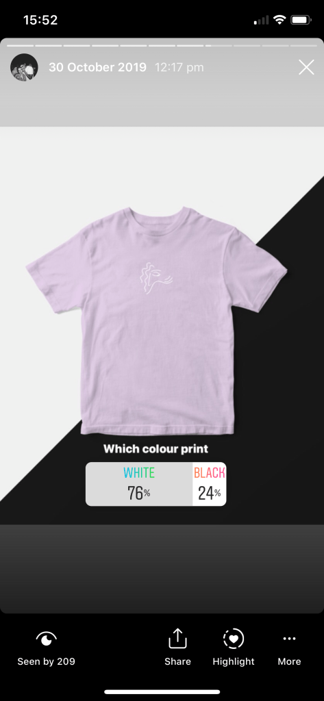

With over three quarters of the voters preferring a white print, the decision was unanimous. This allowed me to feed back off of previous customers, and gain appreciation from a new and upcoming audience of Gemini Branding’s clothing range; receiving messages from those interested, asking “are you selling these right now?” and asking to let me know when they are in stock.
Instagram has proved to be a great tool for self promotion, creating an unsuspected audience. The decided design is something I will look to get into production in the next half of the year and start promoting and selling.
Japan Collection
As 2020 is the year of the Tokyo Olympics, I’ve enlisted the help of my brother who studied Japanese at university in Edinburgh to ensure any writing and authenticity of images, etc are to a good standard. This is important to me as there are many mass produced t-shirts today that are advertised as ‘Japanese print’ but have no genuine translation and are technically ‘just random sounds’ in Japanese. This collection (as well as the one above) is something I look to progress with throughout the next module, as I have been very busy with client briefs, I have focused my time on them rather than continuing with my own personal brand as it is something I can release on my own time.

Lucky Cat illustration 
Logo created for personal instagram (@noodles.ai)
As discussed earlier, multi-colour prints are something I wish to avoid, having difficulties with them in the past. Therefore, there’s still a lot of room for improvement with designs and I may look to make them monochromatic in the future.
 Negotiated Practice - Adil Rahman