
OVERVIEW
Approached by acquaintances at Goldsmiths University London to help develop a brand identity for ‘Eko’, creating a logo, poster designs and more promotional pieces including zine layouts. Eko is a student-led society made by the student action for refugees group, wanting to exercise freedom of expression. Bringing together the voices of refugees, asylum seekers, volunteers and activists, they aim to create a platform for collaboration, awareness and creativity.
IDEA & PROCESS
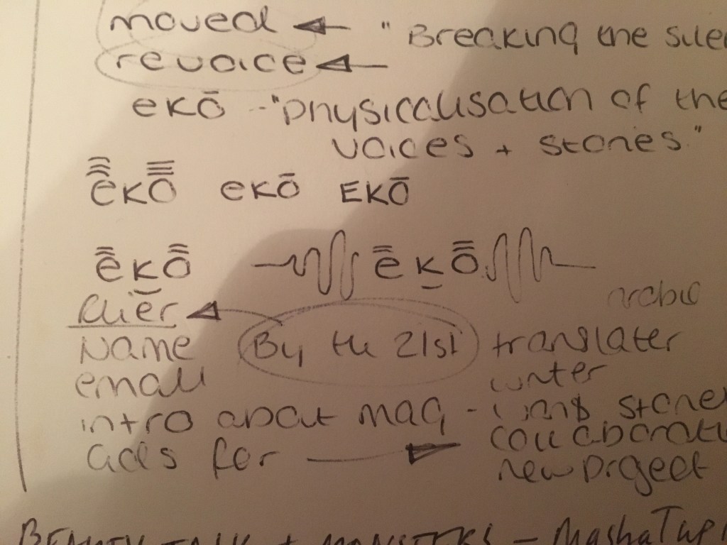
The initial concept came from one of the lead designers on the project, with sketches. These gave me a starting point to develop, taking the sketch and beginning to recreate it in Illustrator.
Creating a simple custom brush by making a stretched oblong and generating it as an ‘art brush’ within Illustrator, I was able to develop the design with a style imitating a hand drawn logo.


I was then sent more images of sketches from the group demonstrating more potential routes to take as they wanted to keep it simple and to the point; easy to read and understand. Reflecting on my first designs above, some become illegible – looking like ‘mekon’ as opposed to ‘eko’.

Developing each sketch further through illustrator, I attempted to use the 3 lines demonstrated in the sketches and try and make an image resembling more of an ‘echo’. However, I considered the outcomes to be rather unsuccessful as they did not stand out; the letter ‘K’ is hard to incorporate into this logo due to its asymmetric nature, especially in comparison to that of the ‘E’ and the ‘O’.


Struggling to find a design we all agreed upon, we attempted various formats: making the text wider, rounded edges, etc. the thicker/block text (above) settled well with most of the group, I decided to carry on taking these further and try and develop it in my own style. Creating a more evolved representation of the initial concept. Then adding colour and shading to make it stand out; varying colour ways to grasp the nature of the society.


Noticing the difference the colours made to the final outcome of my logo, we collectively decided to make some variations of the thicker/block text version, as it was one of the only versions we all agreed on to begin with. As ideally, it needed to be something easily readable and able to print in two tone due to printing costs for posters, etc. we decided on a simple black text with a drop shadow that can be used with any colour way option (dependent on layout, use, etc). In the case of the logo and original poster, we opted for a teal and yellow combination

Being used as a display picture for social media sights such as Instagram, the logo needed to fit square dimensions, to then be cropped circular by demand of the network. (displayed above) Using the same drop shadow effect on the posters for

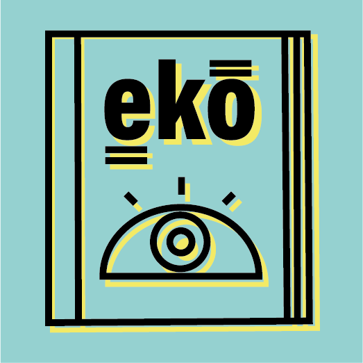


Final Logo design & two additional posters for ‘WE WANT YOUR STORY’ event on the 12th December at Goldsmiths university.
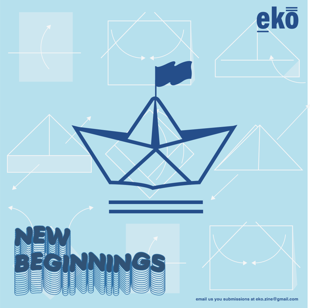
Paper boat with a background image of how to make one 
Compass with a background of co-ordinates 
Instagram/social media posts & ‘business card’ made for eko magazine. Asking students at Goldsmiths what ‘new beginnings’ meant to them inspired the design work for their social media. A paper boat, symbolising the method of travel for a lot of refugees, relieving the horror and actuality refugees have to go to by making a ‘family-friendly’ image. A compass with an underlaying texture displaying the co-ordinates of major cities across the world; representing to new haven and life that refugees seek and aspire to.
Zine Layout
Asked to begin developing a potential zine layout for a theoretical production that they look to create within the next few months. However, as there is little knowledge about images and the sort of publication they are looking to produce it was put on hold until they have further information and can progress.


Event Poster Design
Asked to produce a concept poster for a future event: January 23rd, no current event name, at the bunker venue in Deptford, London. Below is some inspiration from artists such as James Lacey.


Having a rough idea of what I wanted to produce I sketched a very vague outline, so I could understand composition; focusing on design in illustrator and photoshop.


Below are images I used as inspiration and templates for creating my poster design

Disco ball icon. Symbol nightlife of 70s. Retro disco party. Vector illustration 
Disco ball icon white background. Vector illustration, flat design. 



Screenshots displaying each step in my making process; using the golden ratio as a path for the circle objects to follow, ensuring the audience engage with each aspect of the design.


Unsure if the poster would grab the attention of the students at Goldsmiths when posted on a wall, filled with other posters and artwork, I looked to changing the colour scheme; from using pastel colours to implementing bolder, more attention grabbing colours. Below are the different colour texture variation I attempted to see what is ‘eye-grabbing’ whilst also fitting the aesthetic of the brand and the event.


Favourite selections are the teal and red backgrounds. However, after receiving feedback from others in the group, we decided it may be better to print and post a larger variation around the university (choosing the last 4 posted).

